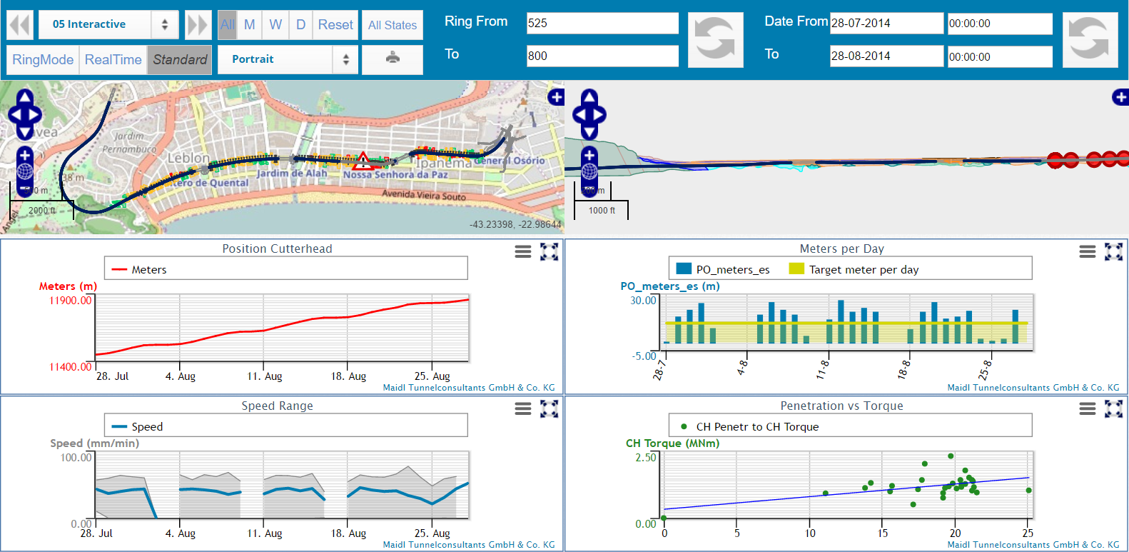
All data from the PROCON II data warehouse can be visualized by
means of interactive and customizable charts. These charts can be
directly zoomed, adjusted and arranged on specially developed
dashboards in the browser. These dashboards gather information of
specific topics and are used to display several sources of data in a
common reference system for immediate comparability. In this
context, your data is linked on dashboards with maps of a geographic
information system as well as a digital ground models in a location
or time reference system.
Each chart is capable of
displaying an arbitrary selection of machine data, target values,
additional information and calculated values in a customizable
visual appearance. For this purpose, line charts, column charts and
area charts are available. For suitable data sources, also pie
charts can be employed.
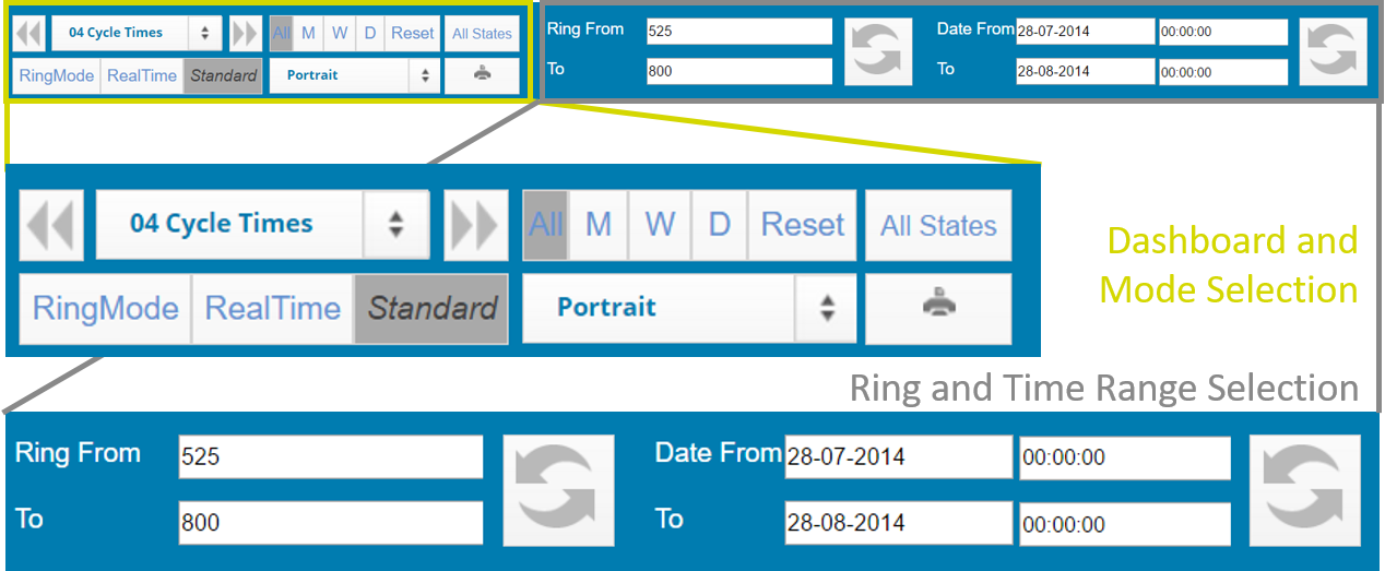
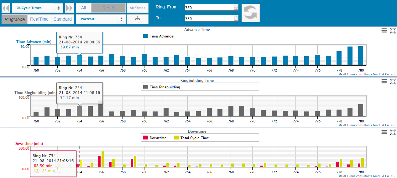
The range of the data to be shown in
the dashboard can be easily and intuitively selected by either
scrolling or zooming in the charts or by picking a time or
ring range in the top menu. Additionally, the last day, week
or month can be selected by clicking the respective button.
After the selection of the respective range you can easily
change the current dashboard using the drop down menu or the
navigation arrows in the top left corner of the dasboard menu.
This significantly simplifies the data analysis.
A
unique feature of Procon is that the all data of all types is
accessible. With am incredible high performance you can zoom,
for example, average values from days to 10 seconds raw data.
All relevant project documents as
CAD drawings, reports on existing infrastructure or buildings
in the vicinity of the tunnel, geotechnical reports, ground
parameters or images can be stored in the data warehouse and
attached to the project-wide geometrical and temporal
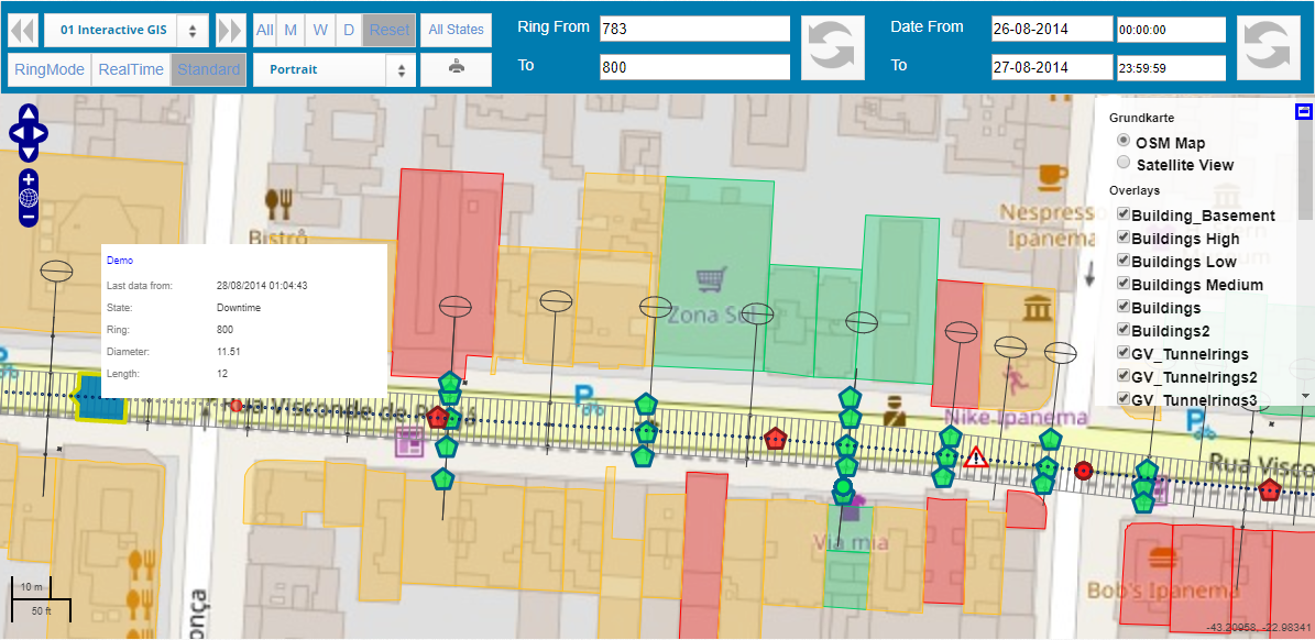
reference system. Using a geodetic information system (GIS)
the relation of these metadata with the automatically acquired
machine data and all further available project information is
displayed on an interactive map of the tunnel and its
environment. Project relevant documents and drawings can be
visualized on different layers. To see the individual layers,
click the "+" Button at the top right corner of the map to
open the drop-down menu. For better orientation, the alignment and the current
position of the tunnel boring machine are marked in the map as
well. It is also possible to display multiple alignments and TBM position on the same map.
Thus, all potential hazards, alert conditions, data and
performance analyses and further visualizations can be
directly referred to the respective location of the machine
and the event.

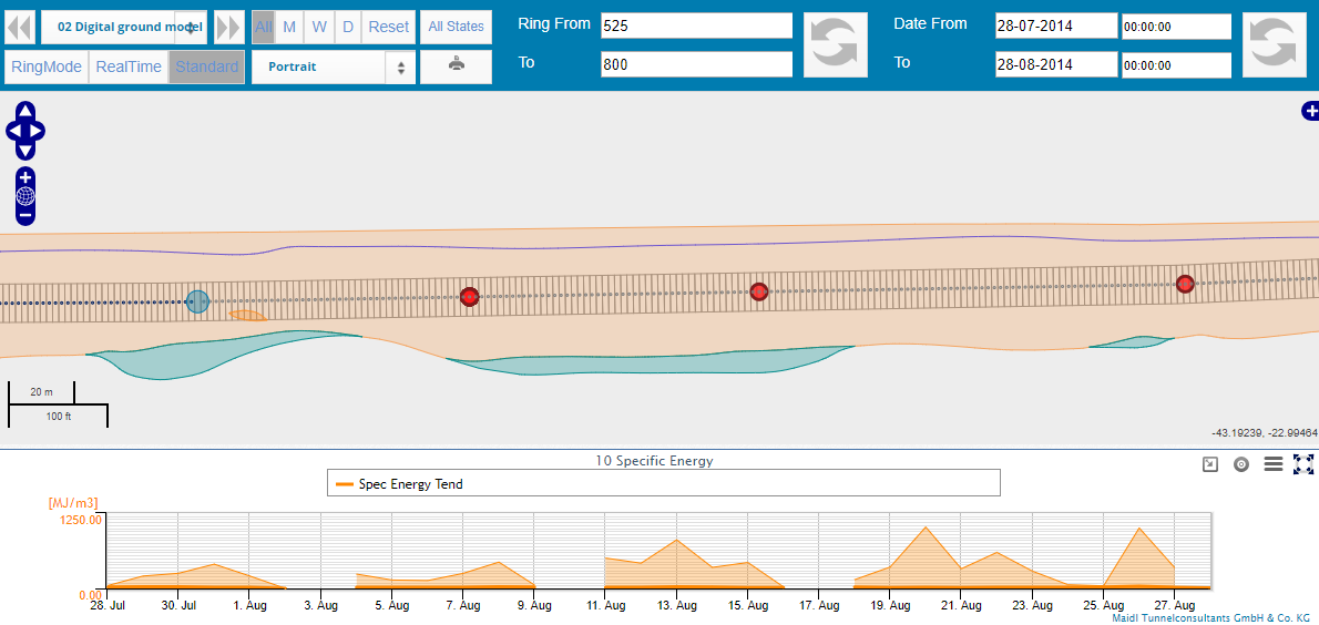
An optional geo-referred ground
model can be stored in the PROCON II data warehouse as well.
This model comprises not only the geometrical definition of
geotechnical layers in the longitudinal section along the
tunnel alignment but also the respective ground parameters
like strength or abrasivity. Thus, the ground model serves as
a reference for wear, consumption and performance analyses.
The interactions of the TBM with the ground are continuously
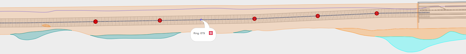
tracked by means of machine data analysis. The current ring is highlighted by a blue circle. Comparing target
and actual values of the ground support, also settlements and
the stability of the tunnel face can be monitored in real
time. In an interactive visualization of the longitudinal
section, the ground model can be further
displayed along with arbitrary data visualization charts on a
dashboard.
All machine parameters and other
time- and location-dependent data can be visualized in single
charts that can be positioned on the dashboard at will. Thus,
you will always have the overview of the current status and
developement of the project.
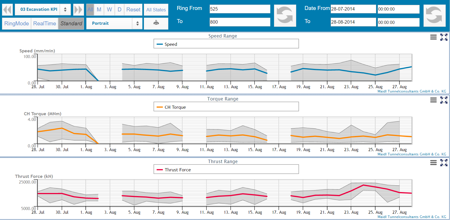
Of course, also production data of
different processes can be arranged in individual dashboards.
In PROCON II, users can generate
individual, interactive dashboards for their specific needs.
They can combine maps, geological models, charts of different
types and individually designed reports. For all elements of
the configured dashboard, data with the same time range are
injected such that they can be compared comprehensively.
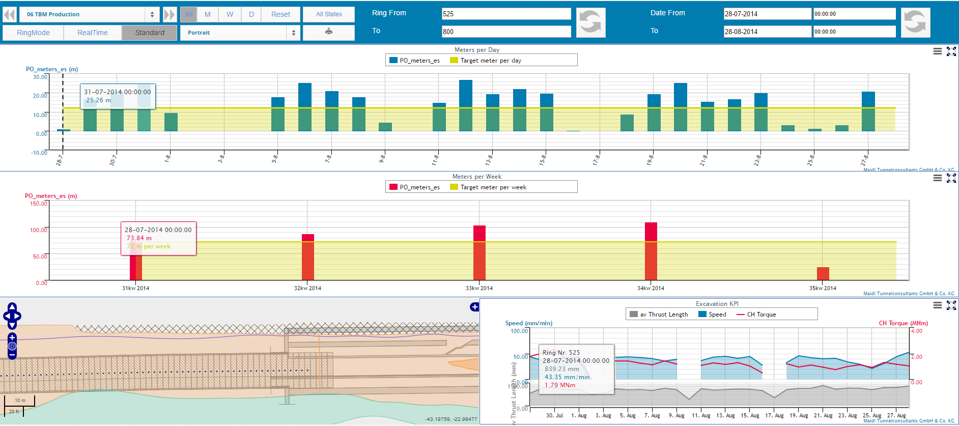
The performance of the TBM for each
calendar day or week can be combined with maps or charts of
machine parameters.
For each advance parameter, target
values or desired ranges can be defined. Additionally,
analytical computations can be performed using the formula
editor. This enables a target/actual comparison on all levels.
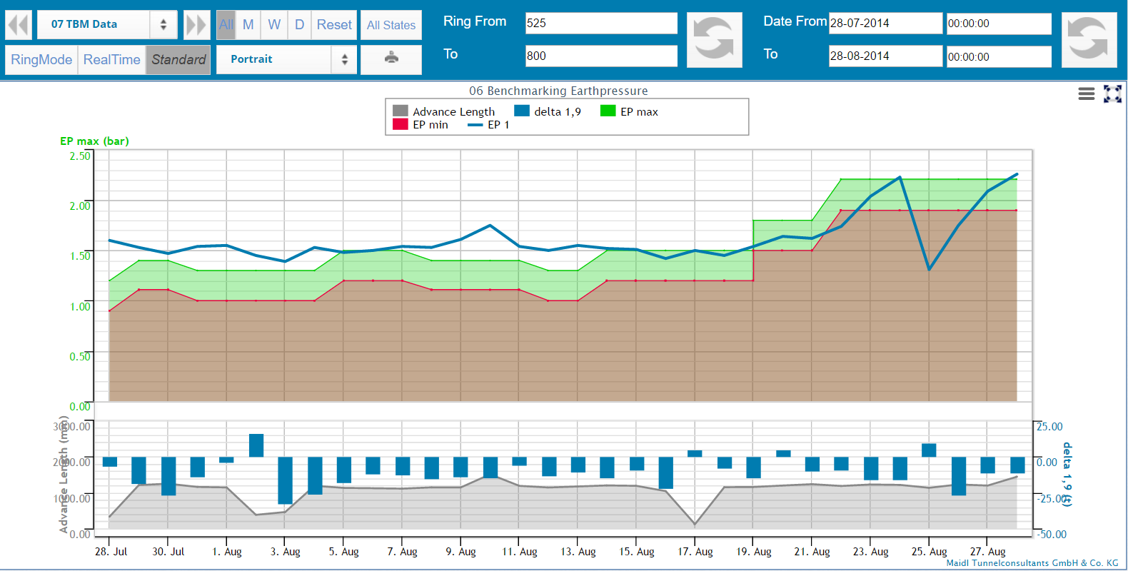
In the presented example, the earth pressure developement is
shown in comparison to the target values of the support
pressure calculation.
In the bottom of the dashboard,
the fluctuation of excavation volume in relation to the thrust
jack extension is presented.
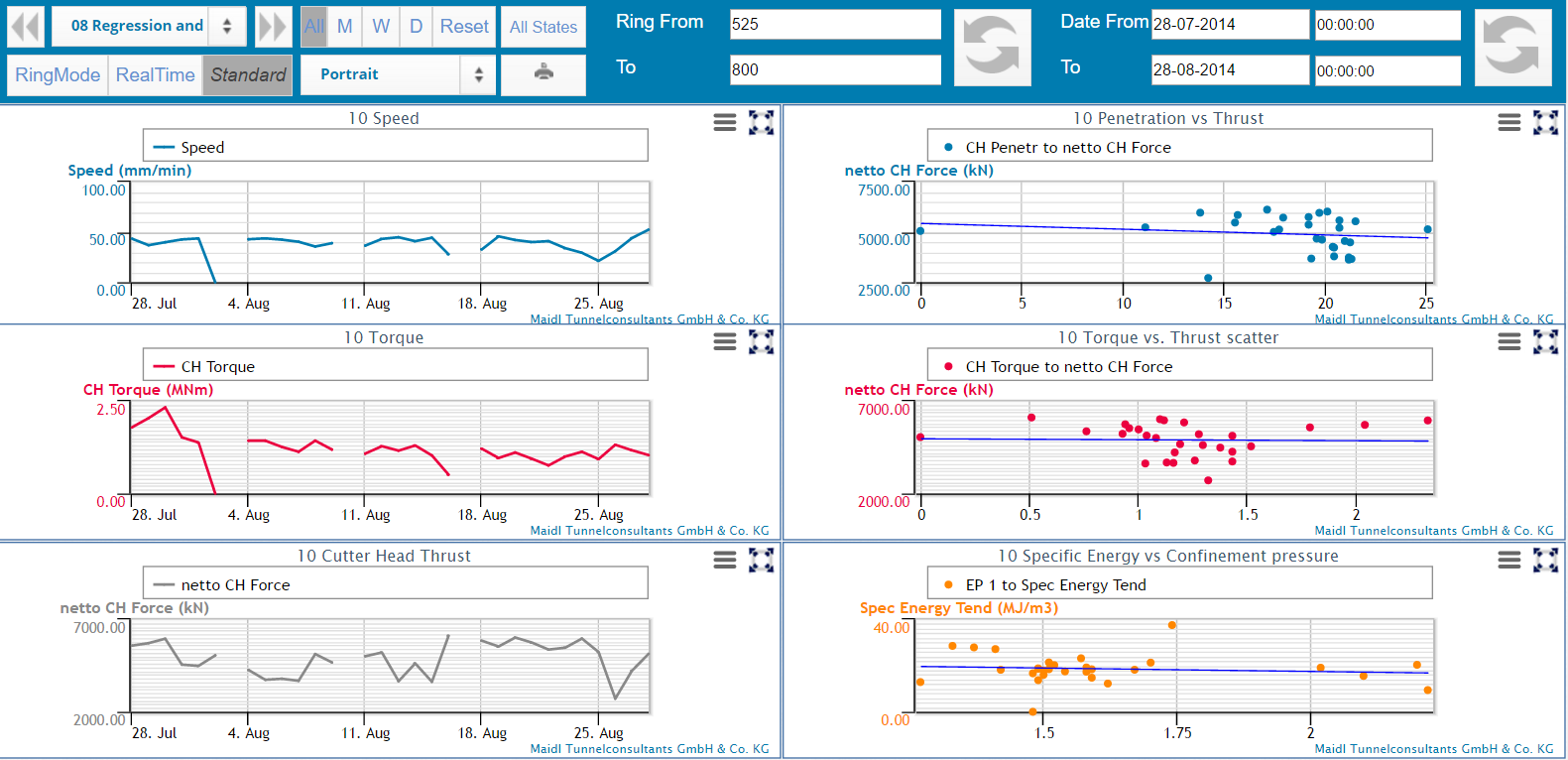
By means of regression charts,
correlations between parameters can be detected.
Thus, changes of ground conditions or effects of steering
decisions can be easily tracked and evaluated.
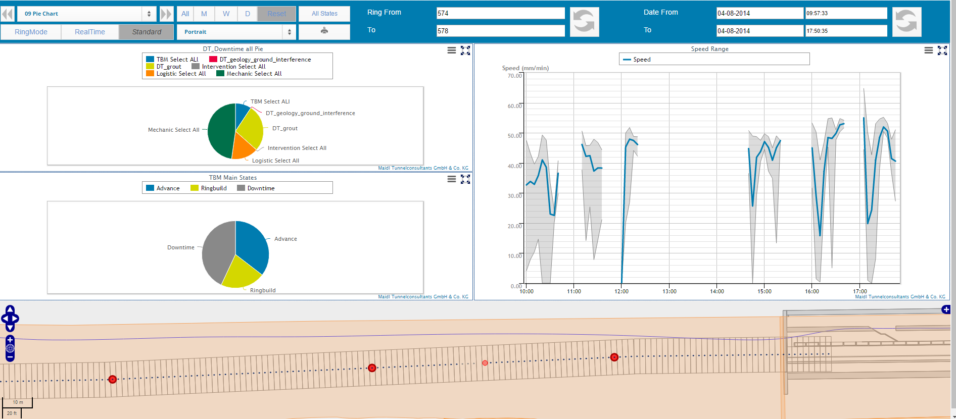
Procon II comes with an integrated
shift reporting module. To evaluate the downtimes, the shift
reporting module offers different chart types like, for
example, pie charts. Here, individual downtime reasons can be
evaluated as well as complete downtime groups.
On the
dashboard, these downtime evaluation charts can be arranged
along with other elements like the geological model or machine
data charts to analyze the reason for delays.
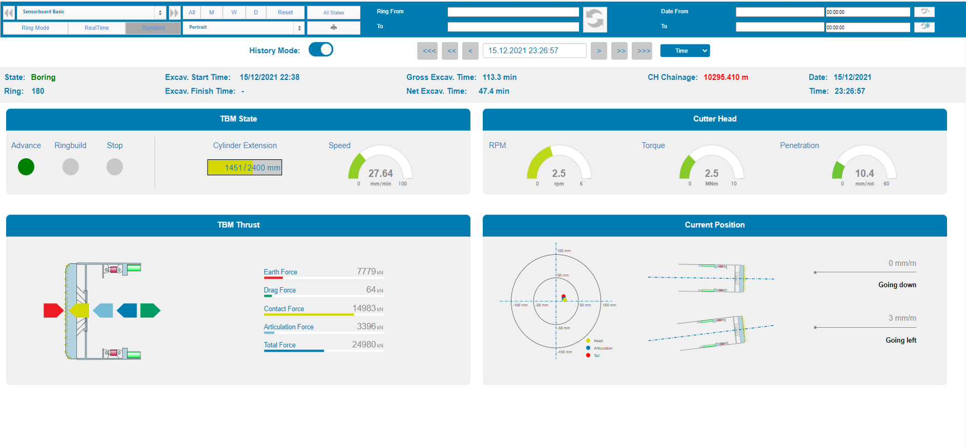
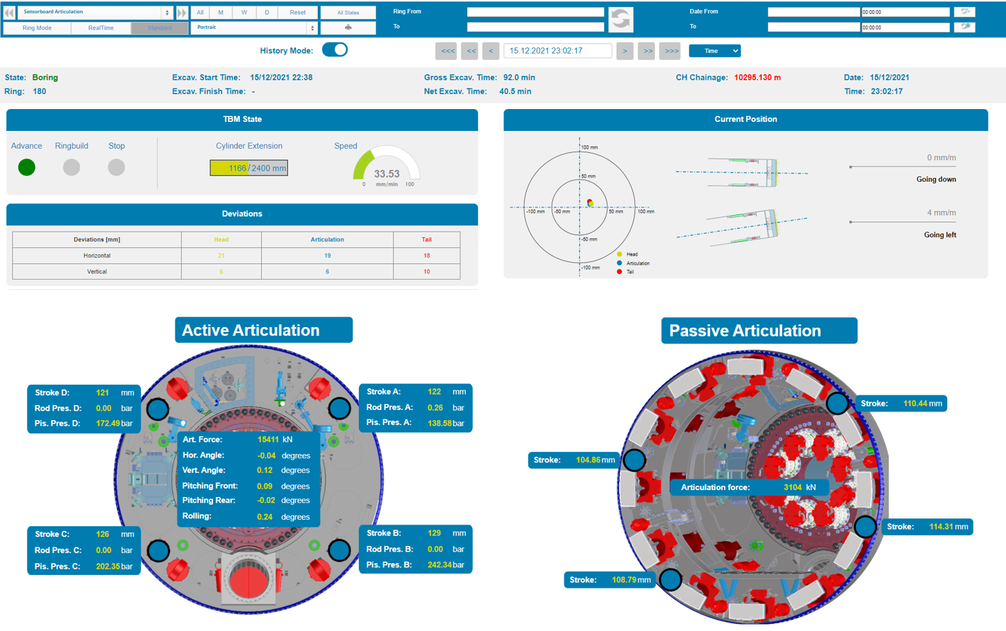
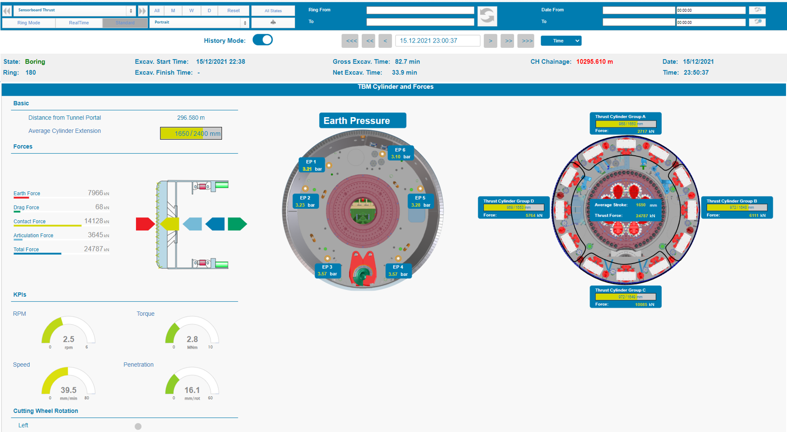
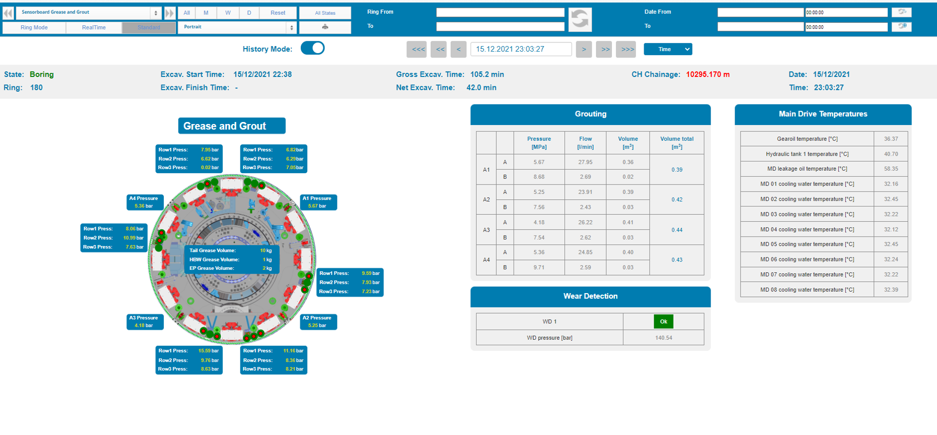
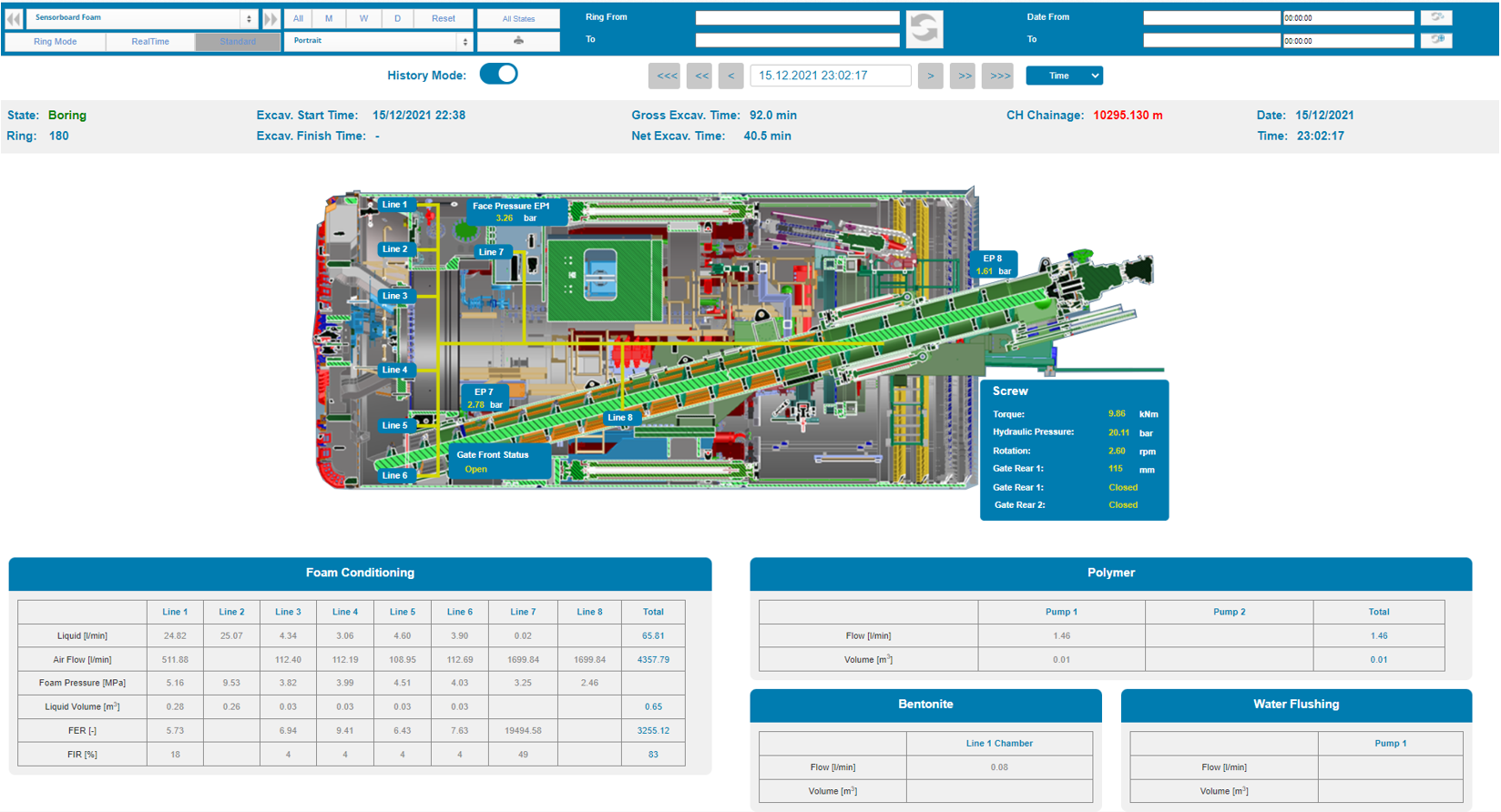
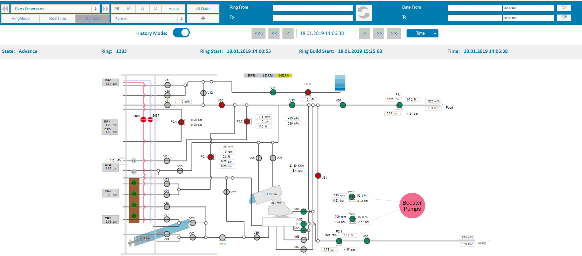
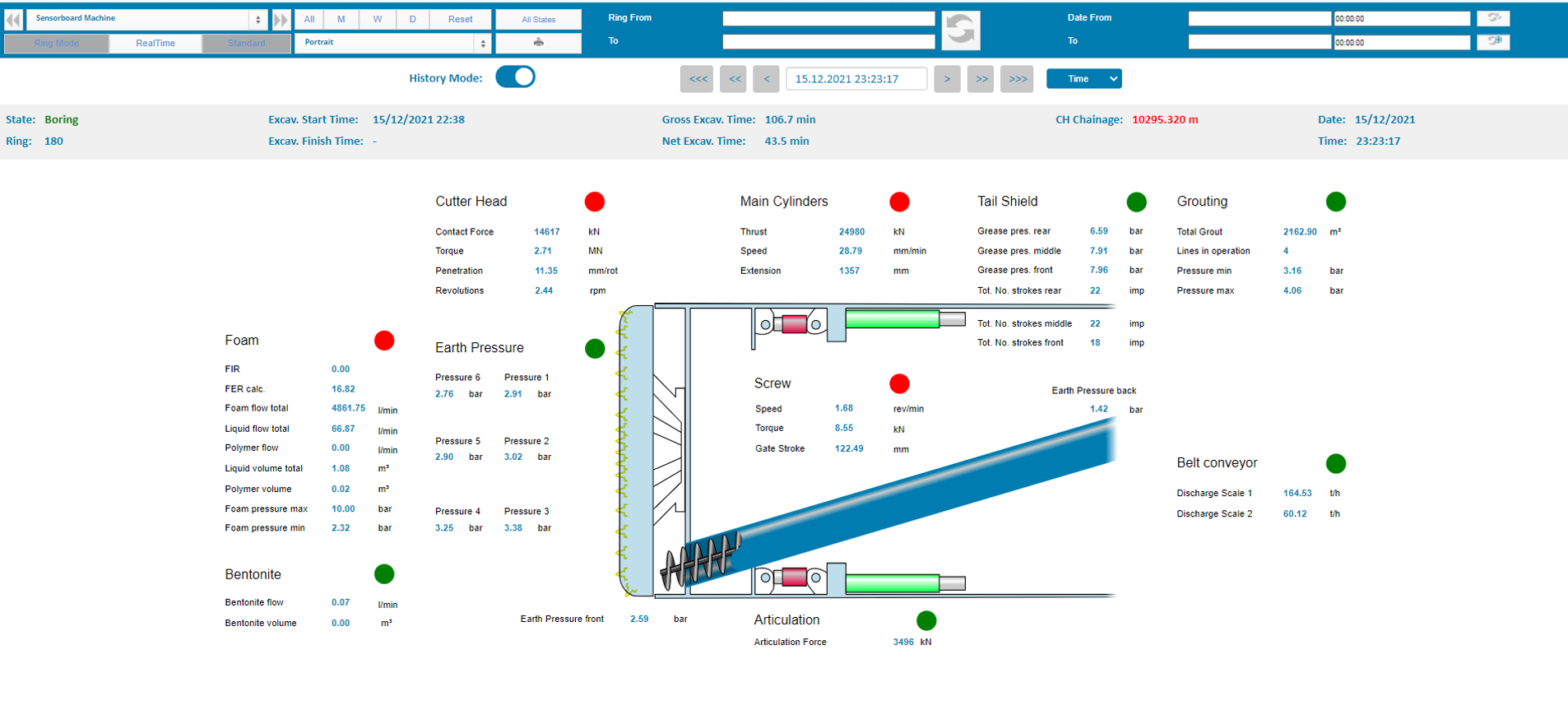
For an efficient and consistent process, mechanized tunneling requires constant surveillance.
Therefore, PROCON II provides one or multiple so called Sensorboards which display the current values of
a selected sample of sensors in graphical and intuitive manner.
MTC provides a basic layout of the Sensorboards but it can be customized for each individual project.
Our Sensorboards are optimized for mobile devices so that they can be used for monitoring the project on the go.
In addition to the "advance mode" which always presents the current data, a Sensorboard can also show historical data.
In the "history mode" you can jump to a defined point in time, ring, or tunnelmeter to analyse the situation at the chosen moment.
For an easy navigation in the time line Quick-Select buttons have been added.
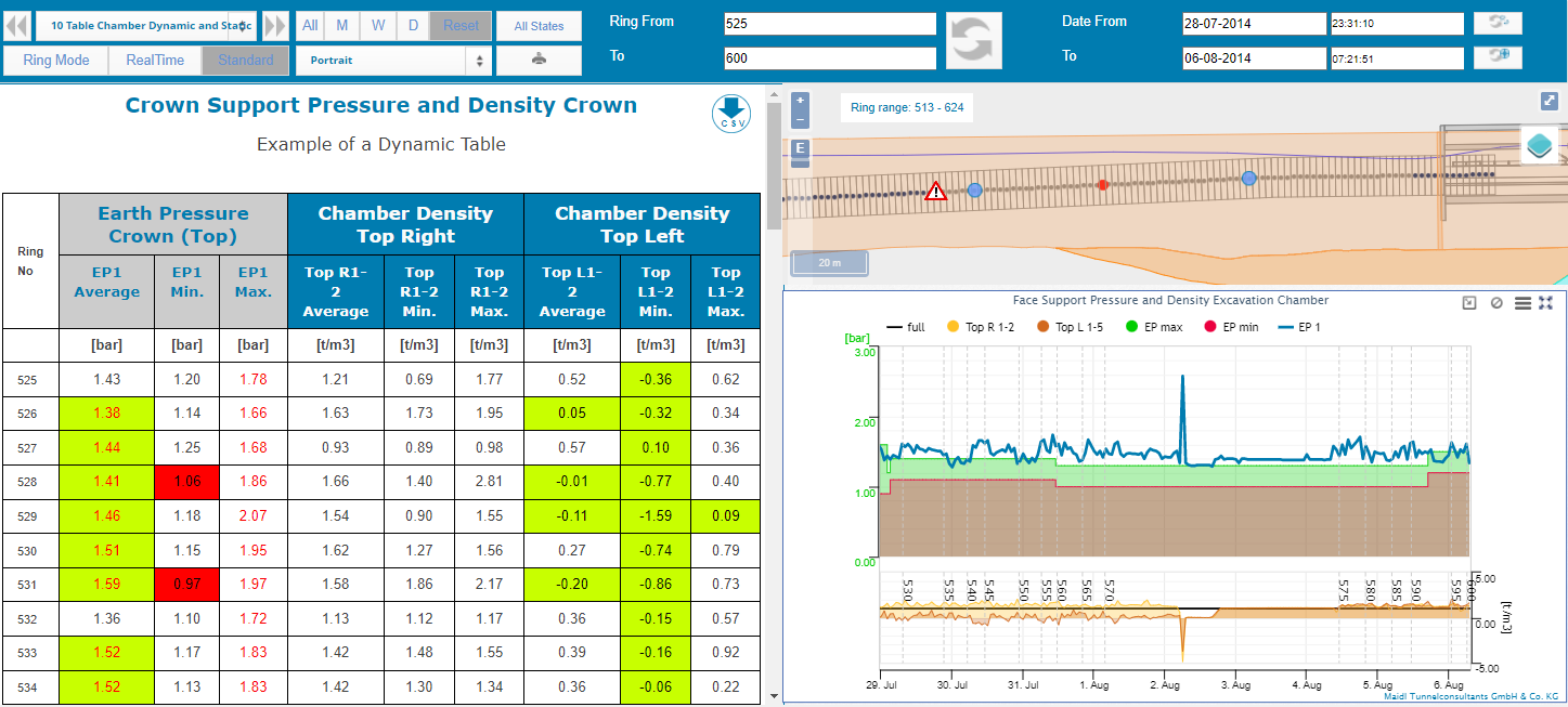
Another tool for evaluating data is represented by data tables.
Data tables are tables that contain data from all types of data
sources available in PROCON which can be combined in a single
table. During the data assembly process, the selected data is
aggregated, for example, generating end or maximum values. Additionally, different
types of aggregations can be contained in a table.
There
are two different types of tables: static and dynamic tables.
Static tables determine the aggregated value for the complete query
period of the dashboard. Dynamic tables generate the aggregated
data for specific time periods like a ring, a day or a week. The
table length is therefore dynamic, since, depending on the query
period of the dashboards, it may be larger or smaller.
The
cells can be formatted as you like. Furthermore, cells with values
can be highlighted by defined conditions for on-the-fly
formatting.